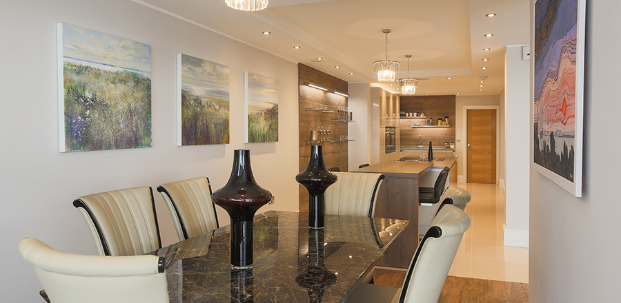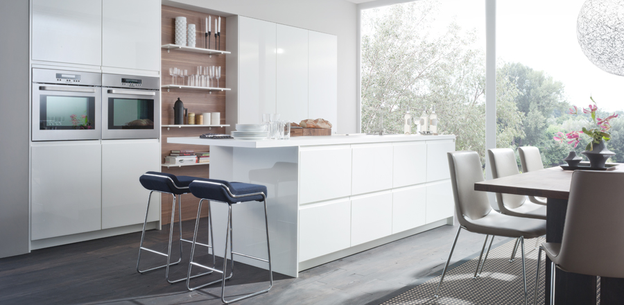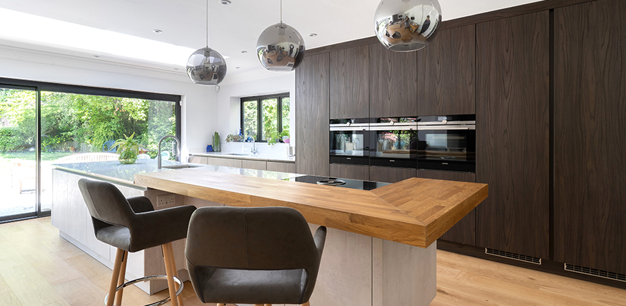



The safest long-term kitchen colours are warm whites, soft neutrals, and nature-inspired greens, blues and taupes that quietly support the room rather than dominate it. Test three to five paint or door samples on real cabinets, in your own kitchen light, for a full week. Let fixed elements – flooring, worktops, tiles, window light – lead the colour scheme so the space feels joined-up. Save bolder colours for easily changed elements like islands or hardware, and keep main cabinetry calm. A free kitchen design consultation can significantly reduce the risk of choosing a colour you’ll later regret.
“I loved sage green a few years ago, but now my kitchen feels dark and busy” is a familiar story. Kitchen colours are harder to change than wall paint, since cabinets and worktops are costly to replace. High-gloss red, ultra-cold blue-greys and stark brilliant white have all dated quickly over the past decade. Whether you’re selecting bespoke German kitchens or updating an existing space, understanding how colour ages is essential. This guide covers how colour changes over time, starting from your home’s light, building a considered palette, and keeping big surfaces quiet.
Colour trends follow a familiar cycle: emergence, peak, mass adoption, then feeling overdone within roughly five to ten years. Colours that last tend to have low to medium saturation and subtle undertones, sitting quietly behind changing décor. Bright teal islands, ultra-cool blue-grey and all-black high-gloss have all looked tired as tastes and lighting moved on – LED colour temperature and more glazing change how a colour reads over the years. Timeless doesn’t mean boring: heritage creams, inky blues and mossy greens have endured for generations and continue to feature across many modern German kitchen ranges.
The most timeless kitchen colour looks like it belongs to the house and its light, not the current trend report. Assess fixed elements first: flooring tone, worktop colour, existing wall colours, and any rooms visible from the kitchen. North-facing kitchens usually benefit from warmer undertones, while south-facing rooms can handle cooler or deeper shades. Try the “door open” test: stand in the hallway and check the colour connects rather than clashes when doors are open. Browsing our kitchen collections can also help you see how different colour palettes perform across a variety of layouts and lighting conditions.
Warm whites and off-whites – ivory, soft linen, chalky white – avoid the harshness of stark blue-white and pair well with wood and stone. Soft putty beiges and warm greiges are chameleon colours, sitting comfortably with cool marbles and warm oaks alike. Greyed-down greens such as sage and olive echo nature and have shown strong longevity, unlike brighter emerald tones. Deep inky blues and bottle greens work well on islands, balanced against lighter uppers. Warm mushroom taupes bridge traditional and contemporary kitchens, ageing gracefully alongside brass or stainless hardware. If you’re looking for inspiration, viewing completed kitchen transformations demonstrates how these enduring colour palettes work in real homes, while ex-display kitchens can also offer excellent opportunities to invest in timeless designs at exceptional value.
A considered palette uses three to four related tones across cabinetry, walls, worktops and backsplash: one main cabinet colour, one supporting colour, one wall colour, and one accent material. Warm white cabinets with a mushroom island, oak floor and brushed nickel is one reliable combination. Choose accent colours that can be swapped out cheaply – textiles, stools, artwork – rather than baking bright colour into cabinets or tiles. This starts alongside the broader decisions covered in How to Plan a Kitchen Layout That Actually Works for Your Life .
Visual layering – light, mid and dark tones – adds depth without tipping into chaos. Use lighter colours for walls and tall cabinets, mid-tones for base units, and deeper shades limited to islands. Save bolder colour for layers that are easy to change: wall paint, stools, pendant lights. An open-plan space with an island – and the clever kitchen storage solutions built into it – can carry a deeper tone. Quiet doesn’t mean all-neutral – even a deep inky blue can feel timeless when balanced with light and natural texture.
Real-world testing beats photos or online inspiration every time. Order sample doors or large paint swatches, stick them on cabinet fronts and walls, and live with them for at least a week, checking them morning, midday and evening. Compare three to five options, including one safer neutral and one bolder shade. Photograph the samples at different times of day to catch shifting undertones. If a colour makes you hesitate every time you see it, it’s not the right choice.
A kitchen should please you first, but it’s worth considering how a future buyer might see the space. Calm, versatile main colours tend to hold their value, while extreme or polarising choices can narrow your pool of buyers. If you love bold colour, express it in reversible ways – painted walls, coloured glassware, an easily repainted island. Small details like handles and tap finishes keep a scheme feeling current without redoing the whole kitchen.
A kitchen designer or colour consultant can translate inspiration boards into a scheme built to last, considering door profile, worktop, flooring, lighting and hardware finish across bespoke German kitchens or simpler ranges alike. Designing solo, limit the palette, gather real samples, and mock up one wall before committing. A free kitchen design consultation can be a useful starting point, and pairs naturally with decisions like choosing between a kitchen island or a table and matt or gloss kitchen doors .
A warm, soft white or pale greige is usually least risky – it works with most worktops and floors, reflects light, and suits modern or traditional styles. Avoid very bright “brilliant white”, as it shows every mark.
Very glossy jet-black can feel harsh over time, but deep, inky blues and bottle greens in a matt or satin finish have shown strong longevity. Keep dark shades to lower units or an island, with lighter uppers.
Warm-toned light colours – ivory, warm beige, mushroom – combat the grey cast of cool northern light. Keep ceilings and upper cabinets lighter, and use bolder colour in smaller accents rather than across the room.
Yes, if balanced – mid-oak lowers with warm white uppers, or a stained oak island in a soft putty kitchen, both work well. Stick to one main wood species plus one paint colour.
Solid timber or high-quality painted doors can usually be sanded and repainted, while vinyl-wrapped or laminate doors are harder to recolour. Prioritise repaintable finishes and keep worktops neutral if you like to refresh often.